Back
CREATIVE DIRECTION | BRAND Design AND STRATEGY
More Than Chin Chin
Building the brand system behind Gratia and The Flourishing Treats Company.
What I did: Built the parent identity and packaging system for The Flourishing Treats Company as Creative Director, working independently through ECOE Studios, covering the company profile, the Gratia packaging system across formats, and the peanut burger and Africa's Finest extensions.
Outcome: The identity stayed in place as the company scaled well past the operation it was built for, including a 2026 Bank of Industry feature reporting a doubling of output, continued retail listings in Nigeria and the UK, and a mention in Air Peace's Lagos to London route coverage.
Scope: Parent company mark, company profile, Gratia packaging across pack sizes, peanut burger and Africa's Finest packaging extensions, production dimensioning with packaging partners.
CONTEXT
The Flourishing Treats Company is a Lagos-based food manufacturer built around Gratia, its flagship chin chin brand. By 2022 the business was moving beyond its earlier identity and preparing for a broader retail operation, translating a familiar West African fried snack into a flake format built for modern shelves.
Much of the category competed through familiarity rather than a clearly structured brand experience. I saw an opportunity for Gratia to retain that familiarity while presenting itself with the confidence of the breakfast brands it could sit beside on the same shelf, Cornflakes, Oats, Cerelac, Golden Morn.
The company was also developing a peanut burger extension and a separate regional brand, Africa's Finest. Gratia could not be the company's only identity forever. The Flourishing Treats Company needed to look capable of holding more than one product line without forcing every product into the same expression.

PROBLEM
On paper, the brief read as a list: remake the parent-company mark, produce a company profile, develop packaging variations for Gratia, design a peanut burger pack, and build a separate identity for Africa's Finest. Treated independently, those requests could have produced five unrelated assets with no reason to belong to the same manufacturer.
The real problem was the relationship between them, and the tension sitting underneath it. Chin chin carries real nostalgia in Nigeria, tied to childhood and home. Lean too hard into that and the product reads local in a way that caps its ceiling. Strip it out entirely and the product loses the thing that earns trust in the first place. The parent identity had to establish trust without competing with the product name, and every pack still had to carry ingredients, allergens, NAFDAC registration, and a barcode without regulation overwhelming appetite.
The system had to hold familiarity, ambition, and regulation in the same six square inches.

ROLE
I led the visual direction across the parent identity, company profile, and Gratia packaging system, carrying that direction into production-ready formats and the peanut burger and Africa's Finest extensions. I also worked directly with packaging producers to translate the system into workable physical dimensions when the company needed to ship materials internationally.
APPROACH
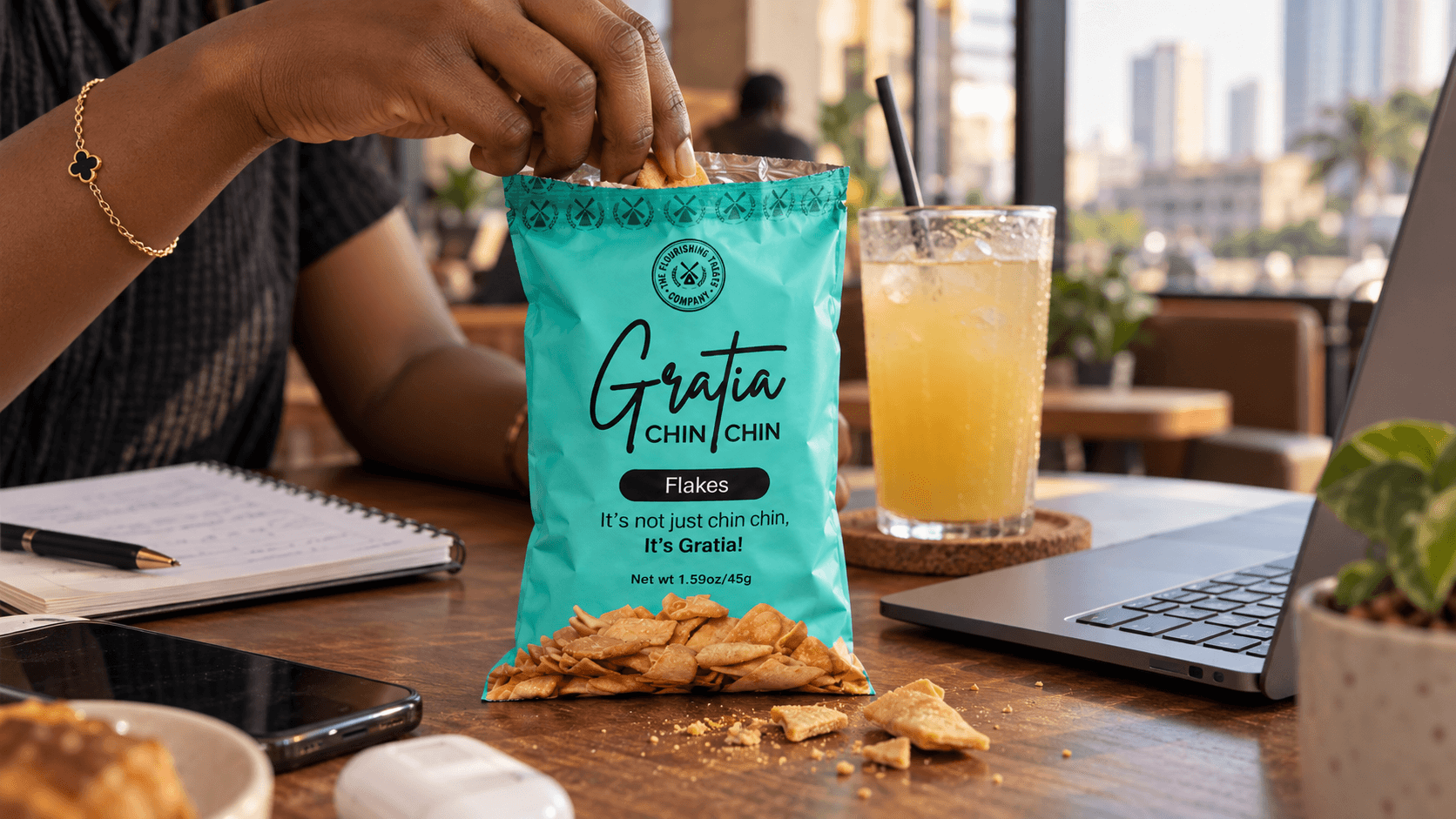
The company came into the engagement with its own idea of colour. I didn't own that decision, but I owned everything it touched after, the look and feel, and the placement of every detail on the pack. Turquoise anchored the core Gratia range, orange distinguished the peanut burger, yellow gave Africa's Finest its own regional register. Colour separated the products. Look and feel is what made people trust them, and I protected that against pressure to simplify or default to whatever the category already looked like.
The bigger decision was how much nostalgia to put on the front of the pack. Leading with sentiment would have made the product familiar, but it risked reducing Gratia to a memory of chin chin rather than a brand competing in its own right. I pushed for nostalgia as a glimpse rather than the whole pitch, carried through the copy and product story, while the front of the pack stayed direct and product-led.

The other position I held was on reusability. It would have been faster to lock one look for Gratia and repeat it across every run. I pushed for a system built to hold multiple flavours and variants without a redesign every time one shipped, a pack that shifts slightly with each new flavour gives the brand a reason to catch the eye again at the point of sale. Retention isn't just recognising one fixed image, it's the brand having enough range to feel alive without losing what makes it Gratia.
None of that mattered without the physical object matching the ambition. I didn't know what price point the company would land on, but I was specific about how I wanted someone to feel picking the pack up, opening it, eating from it. That meant working through the dimensions with production partners directly, so the hierarchy survived manufacturing instead of getting compressed into a stock format. I wanted Gratia to read as considered at every step, sight first, with the product delivering on what the sight promised.

OUTCOME
The work moved past presentation mockups into production files the company could print and ship. Gratia became a repeatable system across pack sizes and adjacent products, while The Flourishing Treats Company gained a parent identity capable of supporting a broader portfolio.

The public evidence shows the system entered the market and stayed there. The current company website and Gratia Instagram account still run the circular TFTC seal, the handwritten Gratia wordmark, the turquoise packaging, and the line, "It's not just chin chin, it's Gratia."
Supermart Nigeria lists the product in 30g, 45g, and 1kg formats. Surulere Foods in the United Kingdom carries individual and bulk formats. Independent reporting named Gratia among the Nigerian products gaining exposure through Air Peace's Lagos to London operations.
A 2026 Bank of Industry feature reported that new investment in machinery more than doubled the company's output and expanded employment. That growth belongs to the company and its operational investment, not to the identity work. Its relevance here is that the brand system stayed intact as the organisation scaled well beyond the size it was built for.
Smaller signals point the same direction. One consumer asked where to find Gratia in Abuja, another posted that they wanted a pack. Individual examples, not campaign metrics, but the kind of thing that doesn't happen around a brand nobody remembers.
This was never only a packaging job. It was the argument for what a growing manufacturer needed to look like before it could compete past its own category.
